■ KRIS by SQL View · B2B · Web
Never miss an expiry date.
Replacing spreadsheet tracking with alerts that mostly set themselves up, after scrapping my own first design.
■ KRIS by SQL View · B2B · Web
Replacing spreadsheet tracking with alerts that mostly set themselves up, after scrapping my own first design.
The problem
HR
A work pass renewal was missed. For several weeks, the employee couldn't legally work.
Finance
Contract renewal dates slipped through a spreadsheet. Negotiations stalled and revenue was lost.
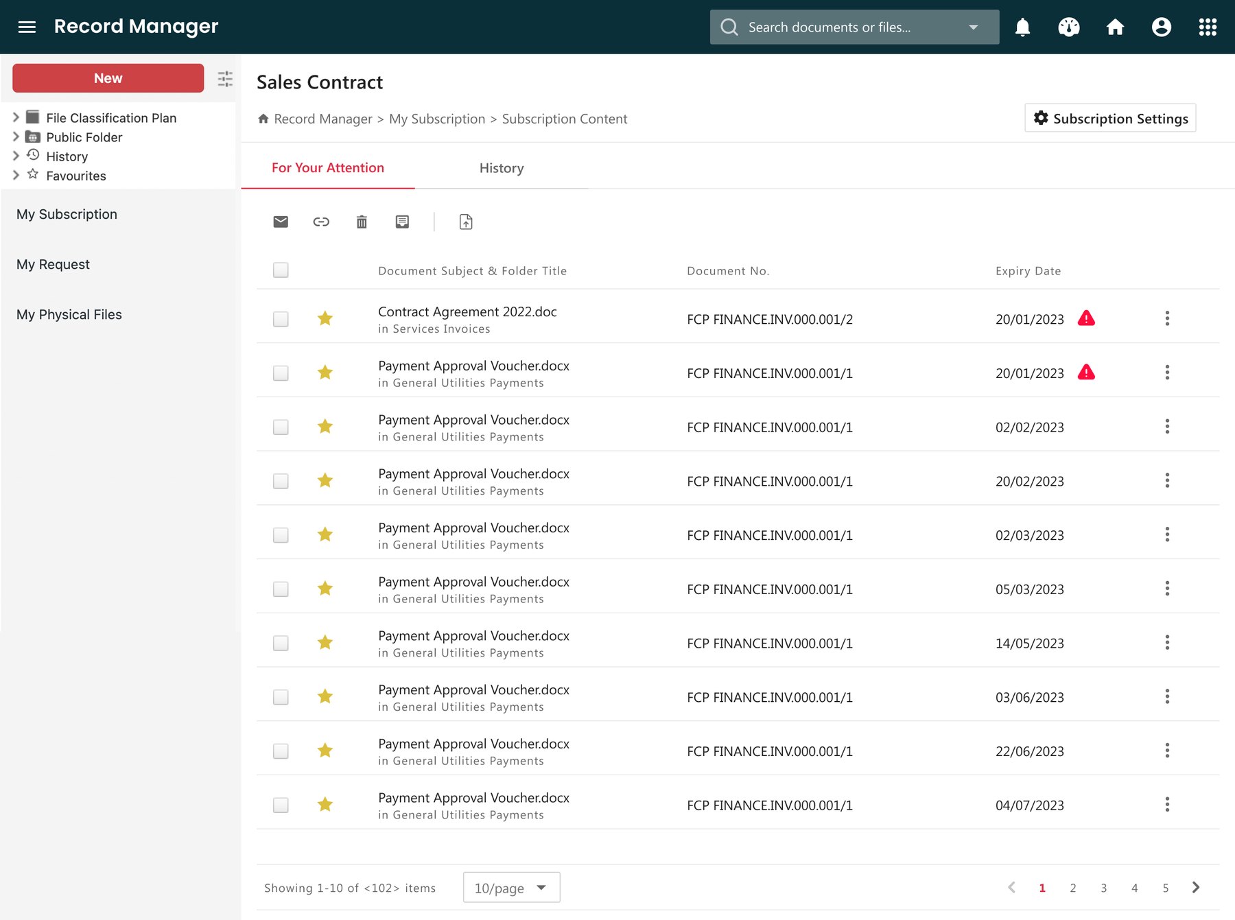
KRIS is a document management system by SQL View, used by organisations that handle thousands of compliance-critical documents. Every document carries metadata like expiry dates and approval deadlines, but KRIS had no way of acting on them. So our users exported the dates into spreadsheets and relied on memory, which worked until it didn't.
I was the lead designer on this feature, from validating the problem through to testing with clients, working with a product manager, two developers, two QA engineers and another product designer.
To understand how deadlines slipped, we interviewed five users across Sales, Finance and Operations, and mapped how each of them tracked a deadline from start to finish.
Deadlines lived in spreadsheets that needed constant upkeep, so people carried the mental load of remembering, and things slipped when that load got too high.
With no warning before a date, people either combed through spreadsheets daily or waited to be chased by a colleague once something was already overdue.
One team watched expiry dates, another contract end dates, another review or renewal dates. Most tools were locked to a single date type, usually expiry, so anything else couldn't be tracked without a workaround.
We also looked at how competitors handled this. Their alert systems were powerful, but setting them up took real effort, which shaped our aim: to be just as useful without making people work as hard.
The challenge
How might we help users track critical dates effortlessly, without building something too complex to use?
With two supporting goals: surface the most urgent cases first, and keep the system scalable for future use cases.
First attempt
My first concept tried to meet every use case found. Users could set the timing, the recipients, the frequency, the conditions, basically anything they wanted.
However, during internal testing, the problem showed. Even a simple alert took too long to set up. In allowing every detail to be customised to fit all use cases, I made it harder to use than it should be.
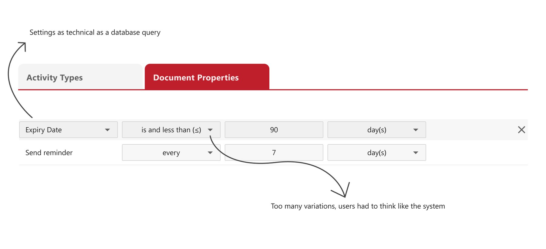
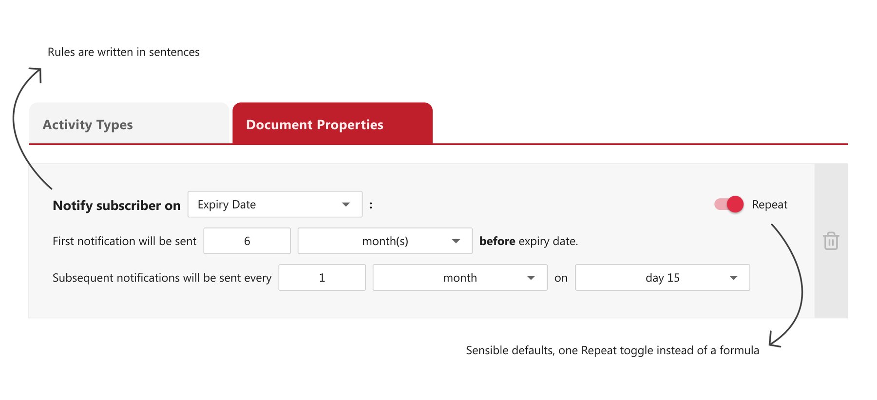
Before vs After - Simplified direction
So I simplified:
Since the setup was where people gave up, I stripped it down to the few choices that actually changed the outcome.
Almost everyone wanted the same thing: a recurring warning before a date. So I made that the default.
I deprioritised the less-common options for later, so the MVP version stayed simple to use.
Testing with clients
This was the company's first user research initiative, so I set up the recruitment process, the research goals and the testing guidelines. Six Finance and HR users then went through four scenarios: setting up an alert, responding to an alert email, finding their way around the dashboard, and changing an existing alert.
completed every task without help. The other two got there with minor issues, small enough to fix rather than rethink.
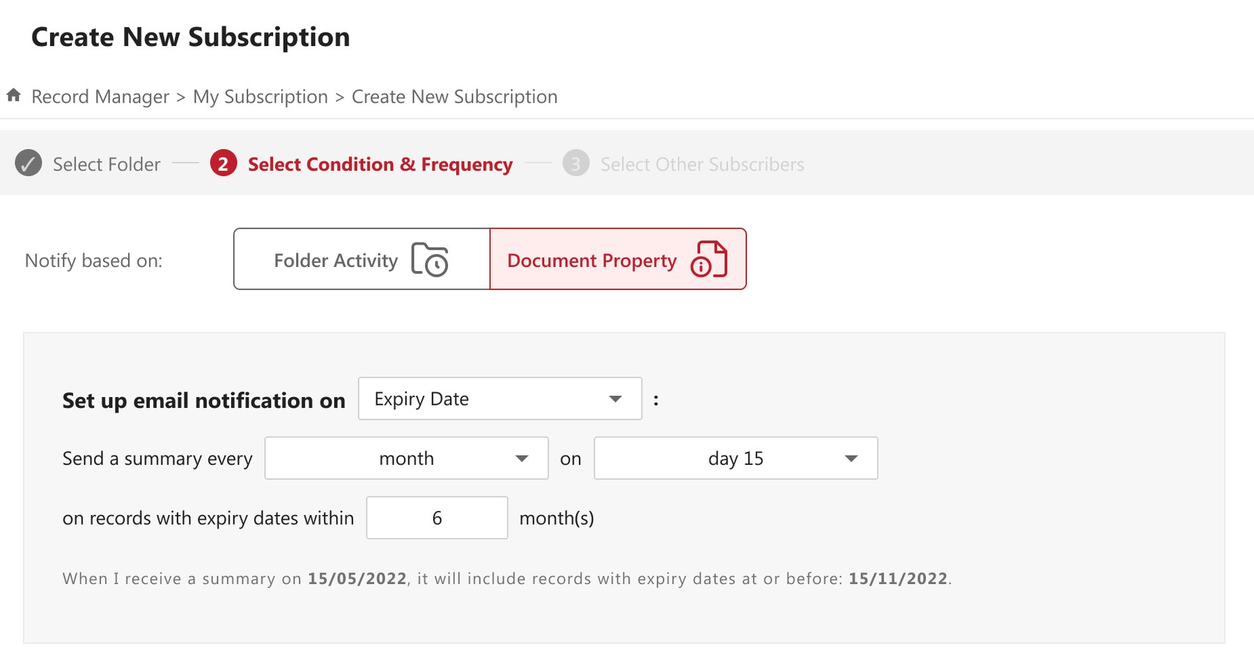
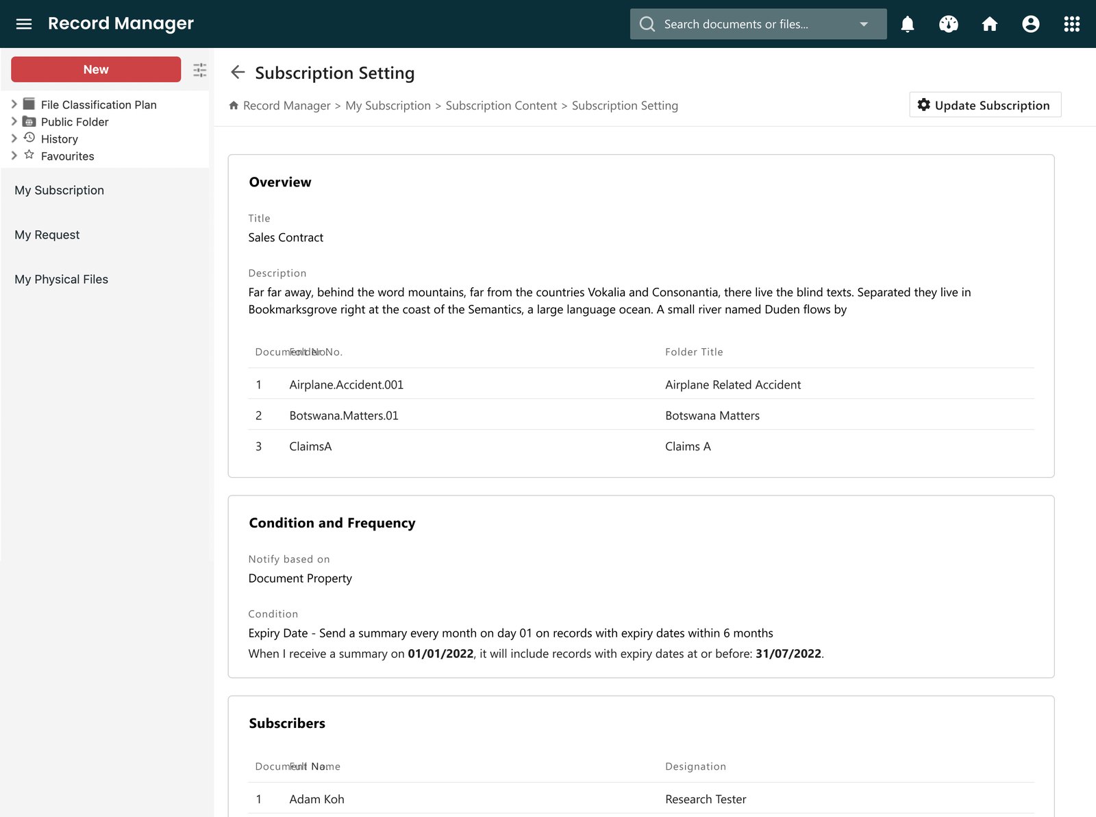
Users stumbled on "distribution list", on "repeat", and on "metadata" itself, the name of the feature. For some, a simpler term was enough. Where that wasn't possible, I added a plain-language sentence under the settings that spelled out what they'd chosen, so they could read it back and confirm.
In the product
"When I receive a summary on 15/05/2022, it will include records with expiry dates at or before 15/11/2022."
Users hesitated between recurring and one-time notifications, so I removed the toggle altogether. Recurring became the only model, and a one-off reminder is still possible through the schedule itself, for example a summary once a year covering records that expire within the next twelve months. Hence less decision at setup.
What shipped
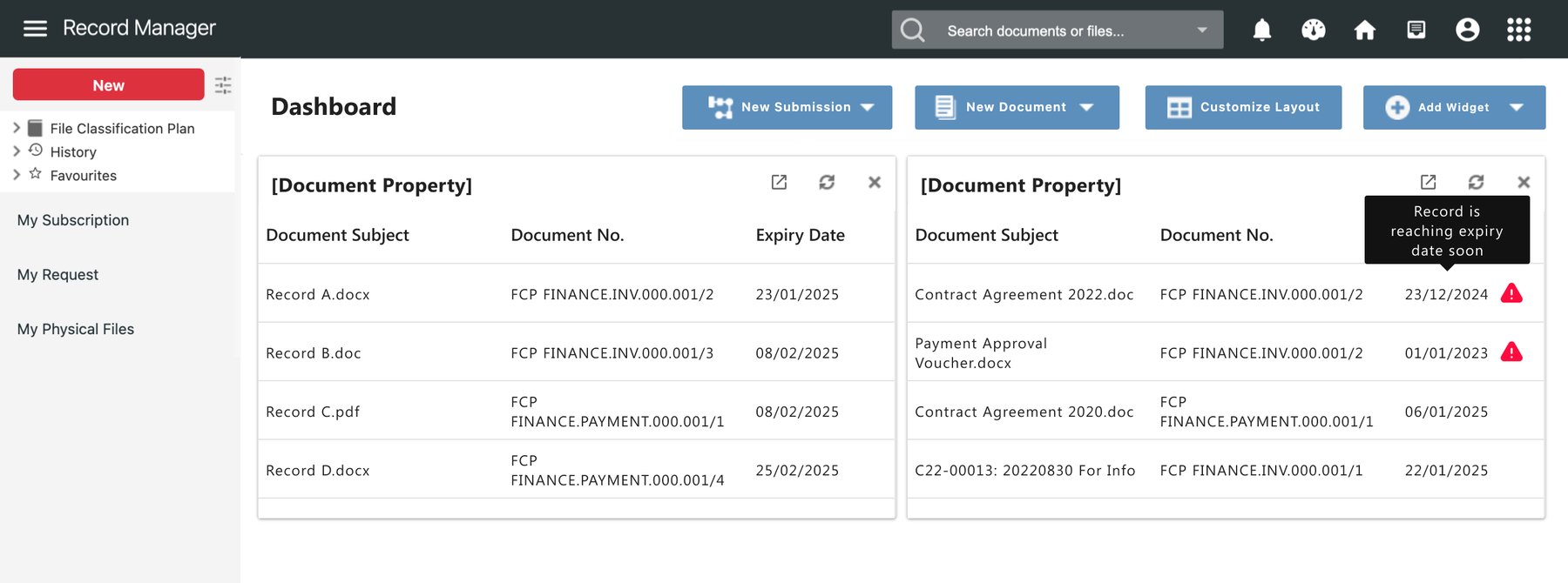
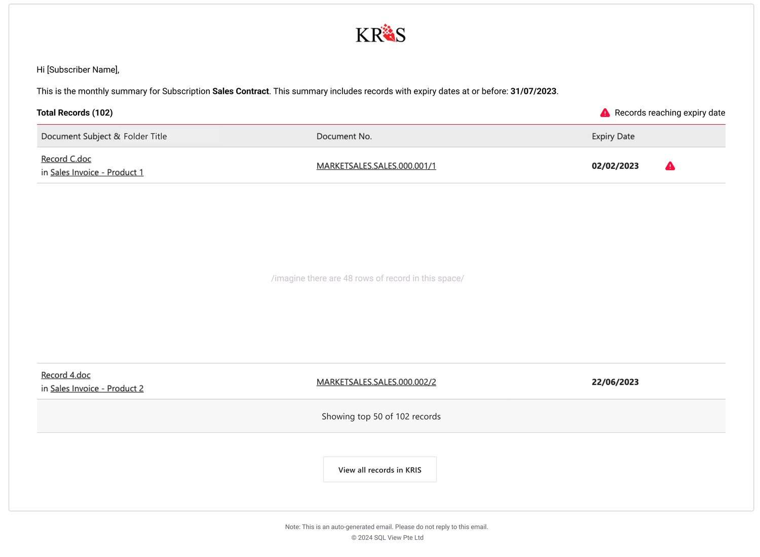
Two clients were onboarded with our help. Early B2B adoption is typically slow, so the honest measure here was whether those first clients kept using it, and I left SQL View in 2025 before I could see that through.
Next time I would define that measure before launch: how many subscriptions clients create on their own, and whether the spreadsheets get retired.
Looking back
I wanted to cover every use case, and that felt like the responsible thing to do then. But looking back, I realised it is easy to keep adding. The hard part is choosing what to remove. (Simplicity is key, cliche but true.)
The other point was the writing. We all know the importance of UX writing, but it tends to get the least time and effort. This project showed me the cost of that: people understood how the feature worked eventually, but got stuck at the beginning trying to understand the terms. I would make time to test the words much earlier now.