■ Yzel by CommerceHulk · B2B2C Web
Finding indie brands without opening twenty tabs.
Designing and shipping Yzel, a discovery platform for independent brands, as a co-founder with a small team.
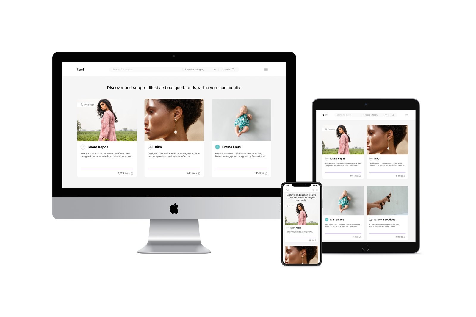
■ Yzel by CommerceHulk · B2B2C Web
Designing and shipping Yzel, a discovery platform for independent brands, as a co-founder with a small team.
The problem
In 2020, the pandemic slowed most of the economy but accelerated e-commerce. My co-founder and I dug into the industry and identified a gap: even as online shopping boomed, discovering independent brands was still a chore. For shoppers, that meant:
Tedious discovery, endless searches and a dozen open tabs.
No easy way to check whether a brand and its products were legitimate.
No way to recall brands they had found interesting before.
Research and analysis
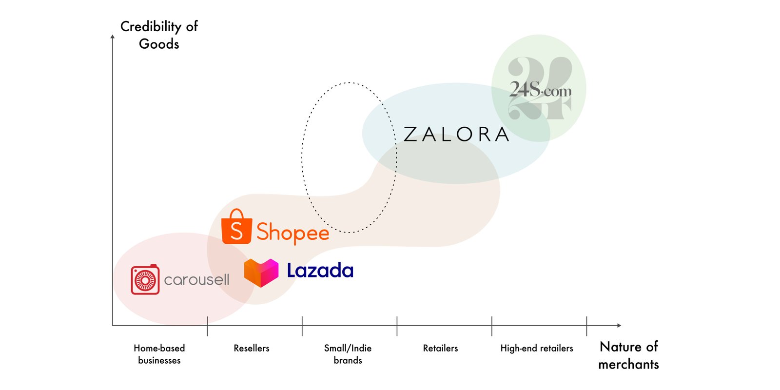
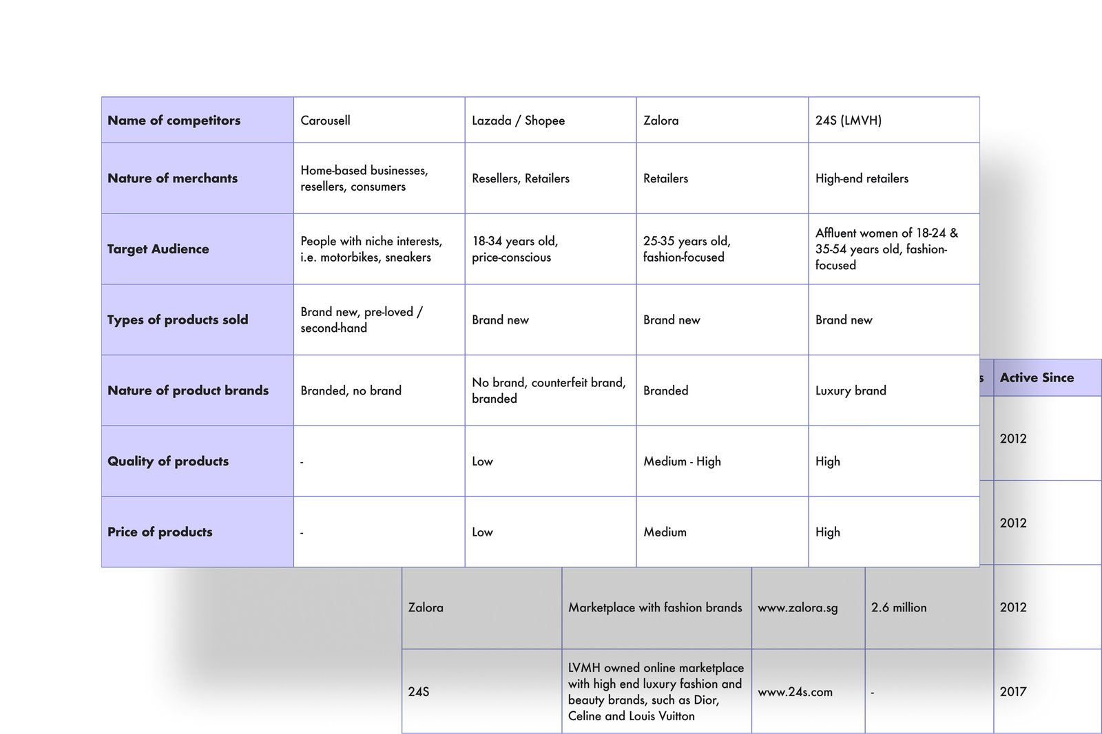
We analysed the competitors within the market and confirmed: indie brands were scattered across Lazada, Shopee and Zalora, but no marketplace was dedicated to them. We also found that the credibility of merchants and their products depended on the nature of the merchants themselves.
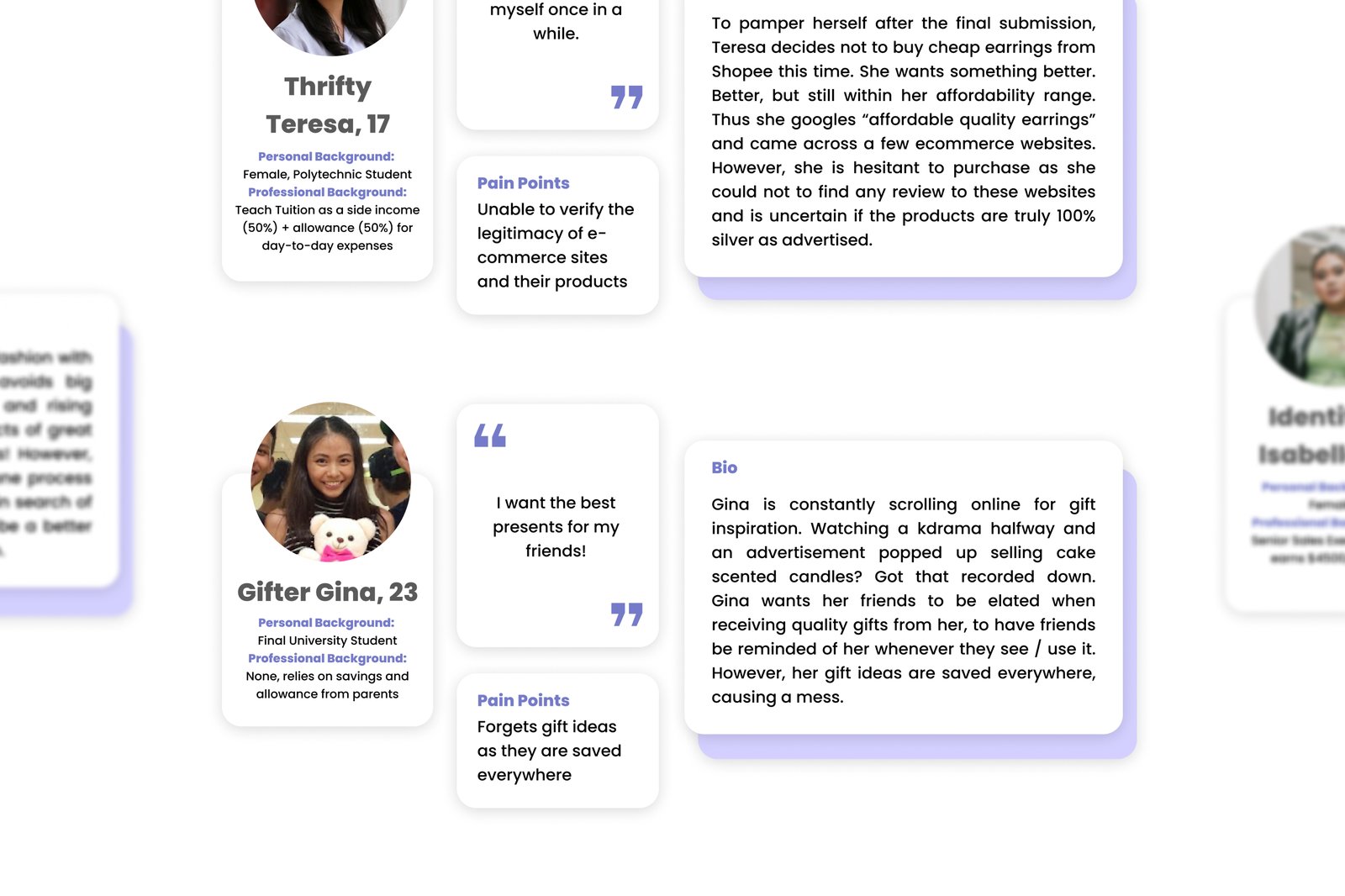
We ran user interviews and built proto-personas. Our target turned out to be affluent, fashion-focused women aged 17–34 who valued authenticity, easy discovery, and trust.
Ideation and prototyping
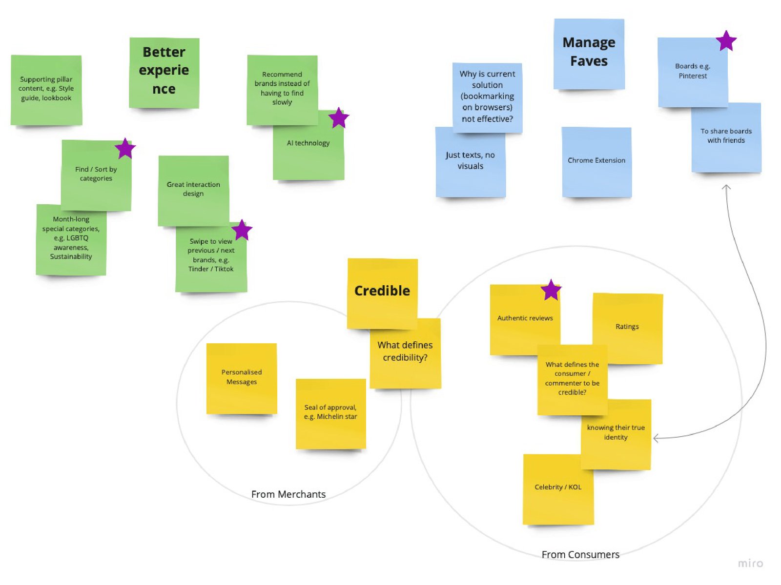
Coming together as a team, we started by brainstorming what would make a "better experience." Using post-it notes, we grouped the key attributes into three pillars: better experience, credibility, and managing favourites. That helped us prioritise features and agree on what success should look like.
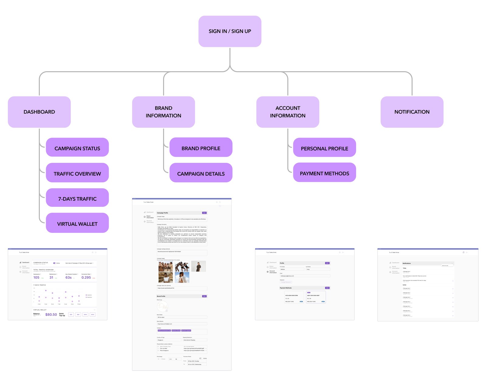
We also thought about the other side of the platform. Brands populate it with content, so how they structure information directly shapes how users discover them. So I mapped an information architecture from the brand's perspective, defining how brand-side features like traffic monitoring and profile management would meet user discovery needs.
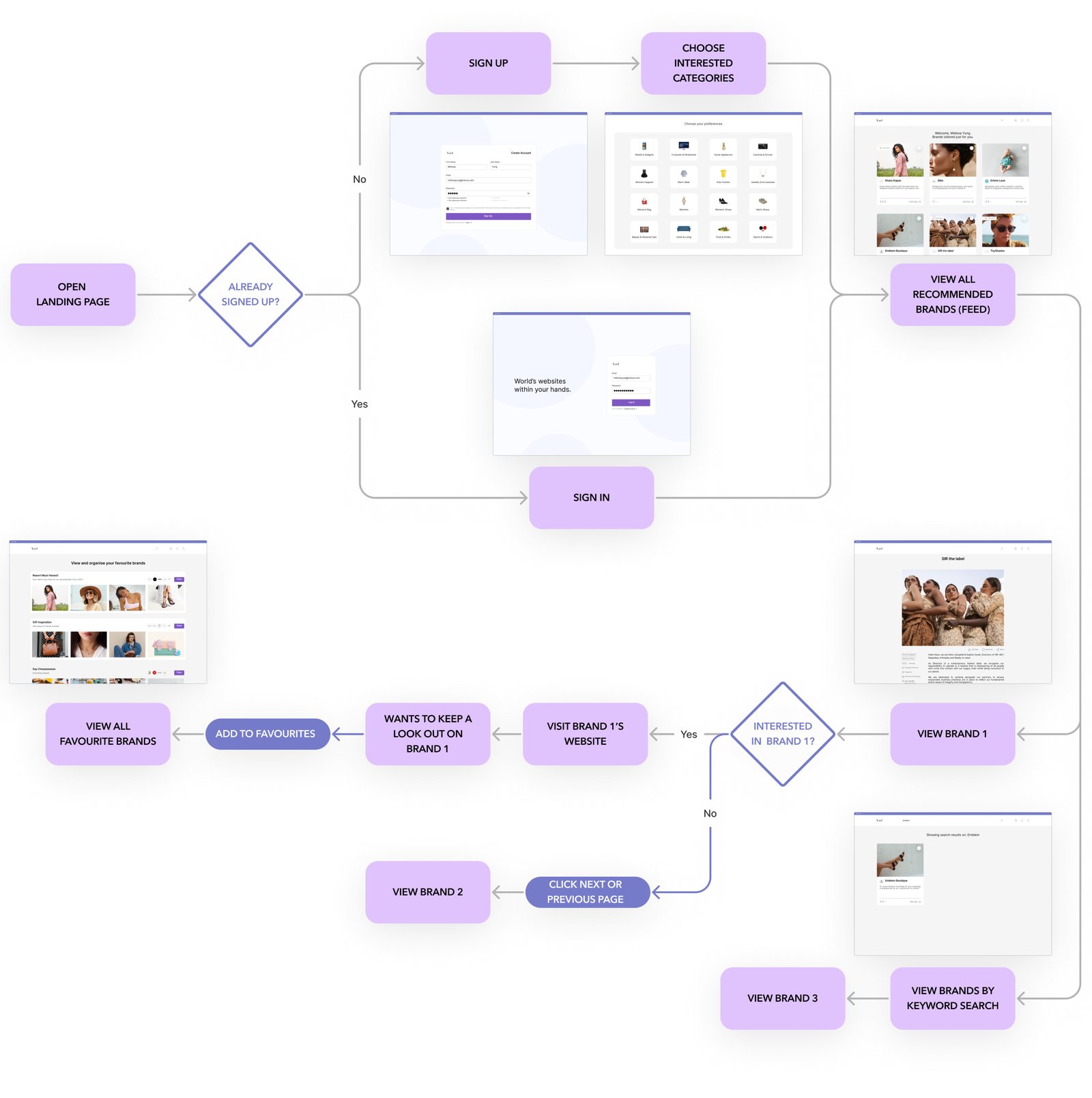
Then we mapped a user flow, from landing on the platform to discovering and saving a brand, to keep every step intuitive.
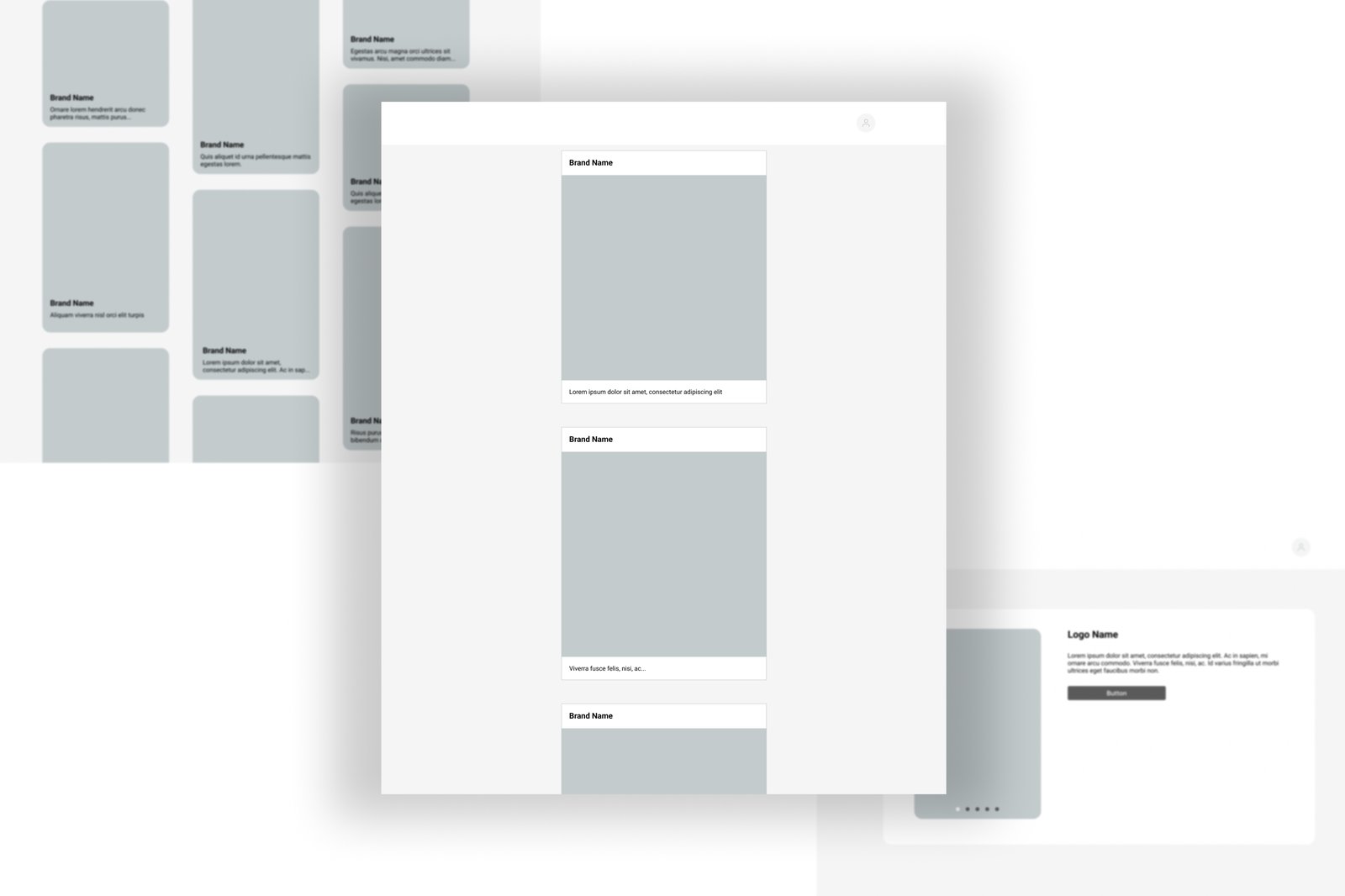
I translated the flow into low-fidelity wireframes, focused on the key features: personalised recommendations, authentic reviews, and favourites. These became the blueprint for testing.
What we built
Recommendations based on what each user liked, so exploring took less digging.
Real customer feedback, so people could trust a brand before buying.
Save brands and come back to them, instead of losing track.
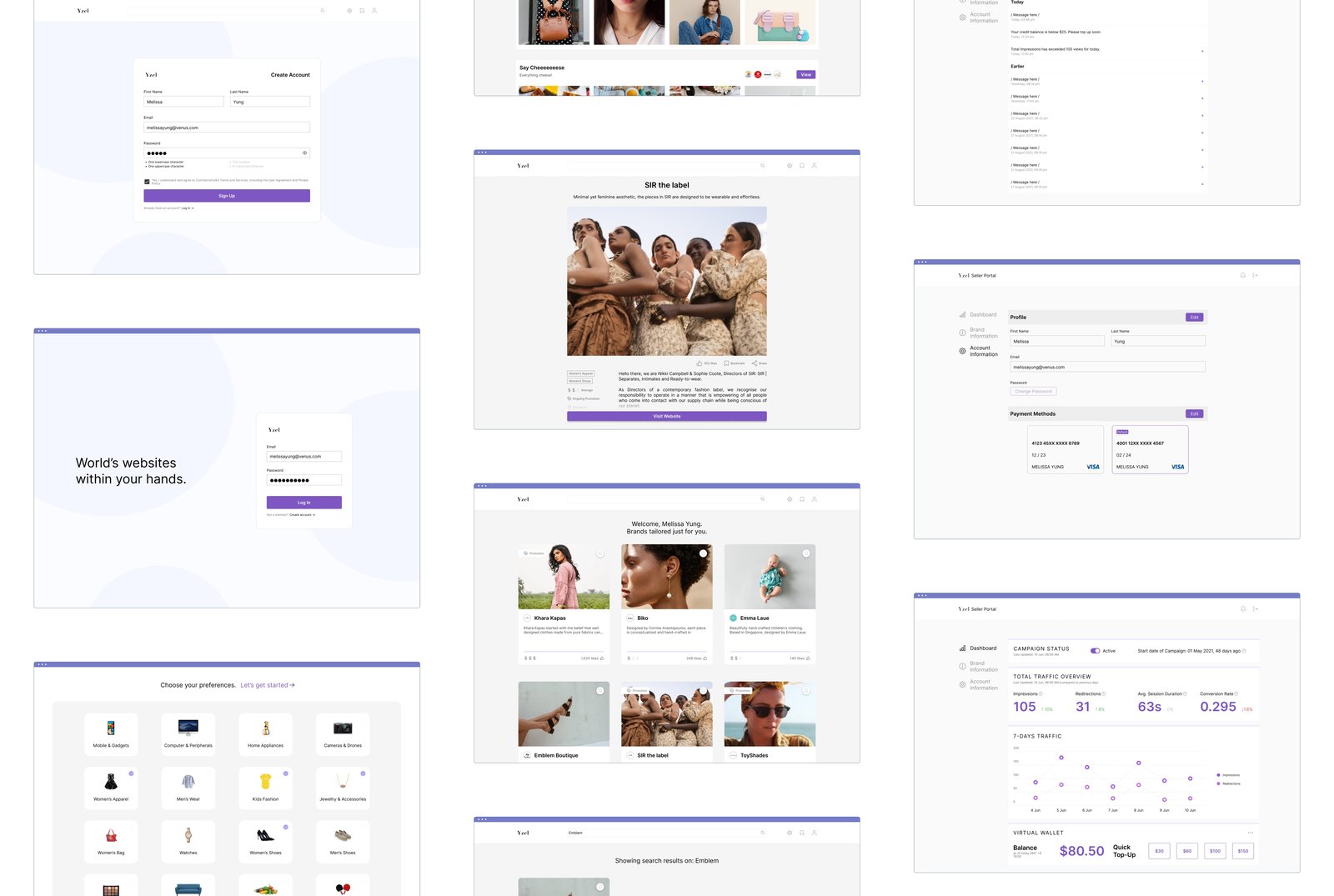
We tested the designs with 20 people, in person and online, and made the changes that mattered: keeping the navigation arrows always visible, dropping ambiguous symbols (like dollar signs) that confused people, and adding category search to narrow results.
Designing for both sides
A two-sided platform, not just a shopfront.
Yzel is a two-sided platform: shoppers discover brands, but brands populate it. So alongside the consumer experience, I designed the seller portal, where brands manage their profile, run campaigns, and track how they are performing, impressions, redirections, session duration, and a virtual wallet for promotion spend. Designing both sides kept the experience coherent: what a brand sets up on their end is what a shopper sees on theirs.
Scoping to an MVP
Our team did not have the technical capability to build everything we had designed. Hence, we defined an MVP, and reassessed every proposed solution by effort required versus impact created, keeping the features that solved a key pain point with the least work. To lower the barrier to entry, users could browse without an account, and the rest was scheduled for progressive addition along our roadmap.
The handoff was challenging initially. I had limited HTML/CSS knowledge and the developers were new to web design. Through constant communication, we figured it out together: an agile approach, features broken into small tasks, weekly check-ins, and everything documented in Google Docs. It was our first real structured handoff.
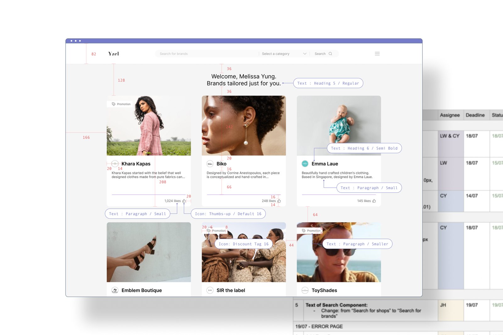
Yzel went live to the public at the end of November 2020. Over the first three months it drew 1,100 users and 125 returning ones, an 11% retention rate that validated who we had built it for.
Looking back
While Design Thinking is a methodology to follow, it only serves as a guide. The design process often needs flexibility to handle unexpected challenges. My key takeaway was the importance of prioritising user research. As we were short on time, we expedited the consumer understanding phase, and that highlighted how much better planning and resourcing would have helped.
Some practices were omitted or not fully implemented, which meant revisiting earlier phases to refine them, a reminder to build the important steps in early rather than reworking them later. These challenges reinforced that design is a continuous learning process, and I'm confident the lessons from this project will shape stronger work ahead.